At Home: A Touch of Madness in 28 sq. m.

Photobucket

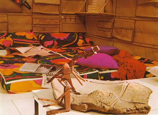
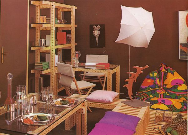
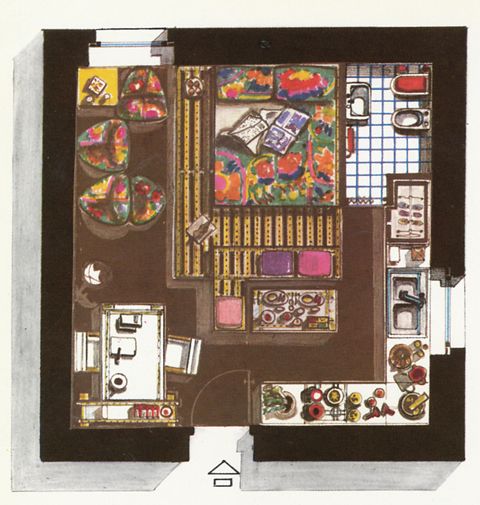
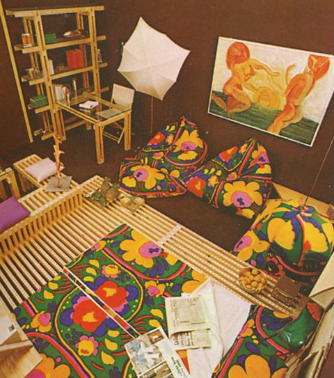
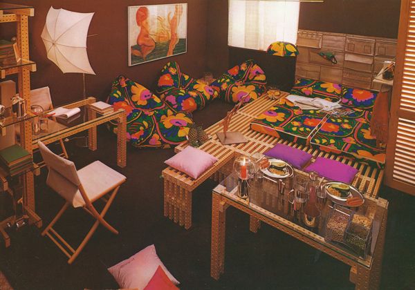
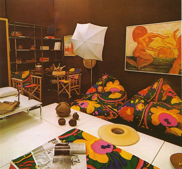
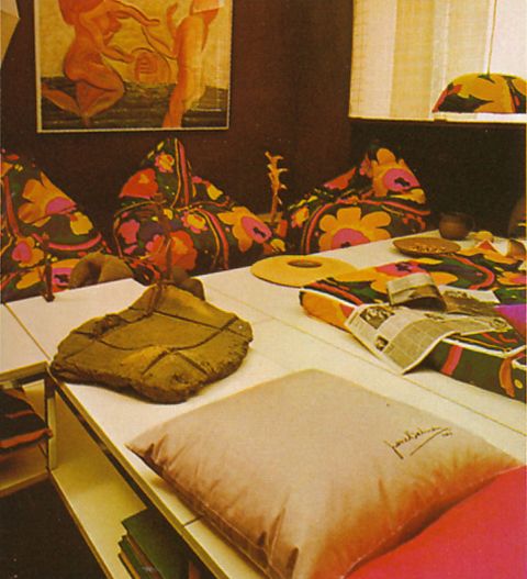
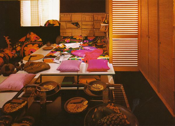
Materials and colours run riot in this slightly crazy an unconventional bed-sitting-room designed for two young people. This informal setting has a bed consisting of a big mattress on a platform right in the middle of the living room, surrounded by brightly-coloured, casual armchairs and cushions.
Photobucket

Photobucket

The Lino fabric on the walls and the Montecolino moquette on the floor are the same colour and provide a monochrome background which is a dramatic contrast to the lively colours of the furnishings. There is no conventional furniture as such, apart from the kitchen unit and the wardrobe; the bed, tables, bookcase and bench have been built out of 'Cartesio' by Ponteur, a type of large wooden meccano which can be made into any shape.
Photobucket

Photobucket

Photobucket

It is also interesting to notice how the room has been furnished using Ponteur's 'Abstracta' units (in metal instead of wood). Two different aesthetic effects have been achieved by using different materials for similar units (see above and below).

The all-yellow kitchen is by Alberti.

The woven straw and rattan wardrobe in the sleeping area is by Dal Vera.

The upholstered elements, coloured cushions, lamps, 'Zip' bed and canvas pockets behind the bed are by Evoluzione.

As a result, this is a home to be lived in and enjoyed. It may seen a little ostentatious for some tastes and is certainly unconventional, but then conventional designs, however rational, can often become boring, and may cramp the personality of the inhabitant.
Photobucket


Photobucket

Interior designed by Mariella Serpi. Text by Franco Magnani. Scanned from One Room Interiors, 1979.

Soft Impressions

Photobucket

Kotex ad scanned from Ladies Home Journal, November 1967.


At Home: It's Supergraphics, 1968

Photobucket
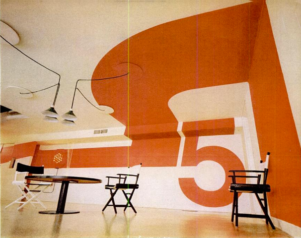
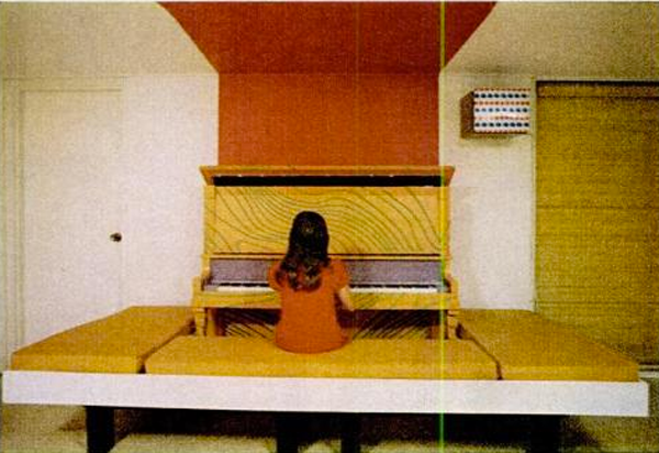
Giant designs heighten ceiling and stretch walls of Jay Vlock's home outside New Haven.

Photobucket
Pained band provides the backdrop for piano, played by the youngest of the five Vlocks.

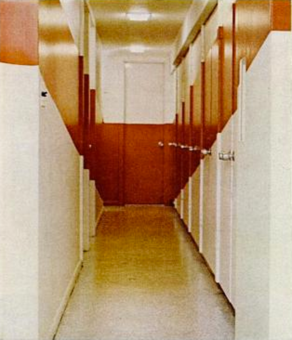
The whole idea of supergraphics is to knock down walls with paint. That's what a growing group of young architects and designers are trying to do - change the apparent shape of rooms, bring order to rambling space, break up boxlike confines - all by applying outsize designs to floors, walls and ceilings. To lengthen that room at top, Yale architecture student William Grover designed a swirling band for the ceiling that continues down the wall to line up with the piano. He added a billboard-sized numeral to heighten the 6' 10" ceiling. A can of paint - artfully applied - is much cheaper than remodeling. And if it doesn't look right, you can just paint it out.

Photobucket

Photobucket

Photobucket

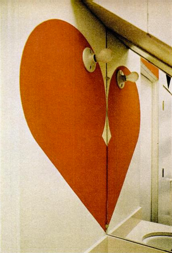
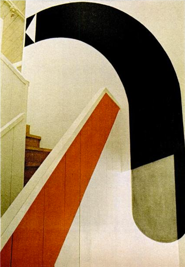
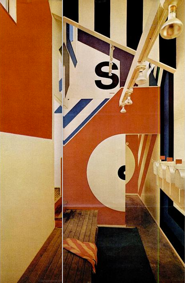
When a dwindling budget shrank the size of the bathhouse at Sea Ranch, a resort community north of San Francisco, the architects called in Graphics Designer Barbara Stauffacher to dress up their diminished interior. In only three days, Mrs. Stauffacher transformed the stark white walls with wrap-around supergraphics that delighted the builders and residents alike. Mrs. Stauffacher did most of her designing right on the walls with charcoal, letting two sign painters fill in the colors. In the ladies' lavatory, she drew half a heart that becomes a whole one when reflected in the mirror (three above). Along the stairway, she place a bold directional arrow that points the way upstairs to the women's locker room (two above). In the men's locker room, a half circle borders a doorway through which is seen a matching half (above). In the women's section, she lettered the word "sauna" in one corner (below) and painted hairpin stripes around another (two below). In the cramped space mailboxes serve as lockers.

Photobucket

Photobucket

Photobucket

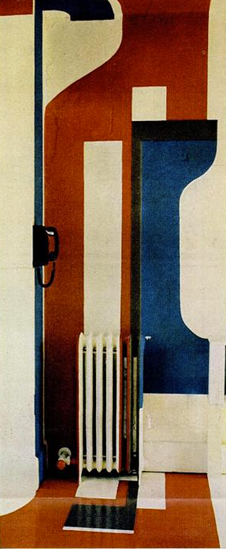
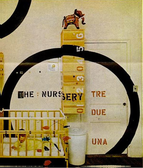
Awkward areas in a house, apartment or office are easily painted away. In the Vlock home (above), a 30-foot hall is shortened by slanting bands that broaden to twice their width at the far end. New York architect Hugh Hardy and his Italian-born wife created a nursery in their one-bedroom apartment by painting and labeling a circle (below). Architect Doug Michels devised the ceiling-to-floor design (two below). It camouflaged a radiator in the former New Haven office of Charles Moore, whole firm designed that bathhouse above. Moore calls supergraphics "a magnificent device for playing with scale. They make a toy out of a room."

Photobucket

Photobucket

Scanned from Life Magazine, May 3, 1968.


Ceramic Garden Stools

We remember precisely the first time we saw our first garden stool.  It was at the Mondrian Hotel on Sunset ten years ago.  They were in the bar and they were all white.  They look really cool--all traditional in a very modern decor that the Mondrian Hotel is known for.

Now it seems ceramic garden stools are everywhere.  For good reasons too--they are really versatile, inexpensive, easy to clean.

Although they are called stools, we don't think we ever see anyone ever sitting on them.  They are probably too delicate for that.  More frequently, they are used as side tables, as you can see from some of the examples here:

Photo Credit:  House Beautiful


Photo credit : Sothebys

Some of our favorite ceramic garden stools:


To see similiar stools featured in the images above, check out our garden stool section. We just added a bunch of new stuff!

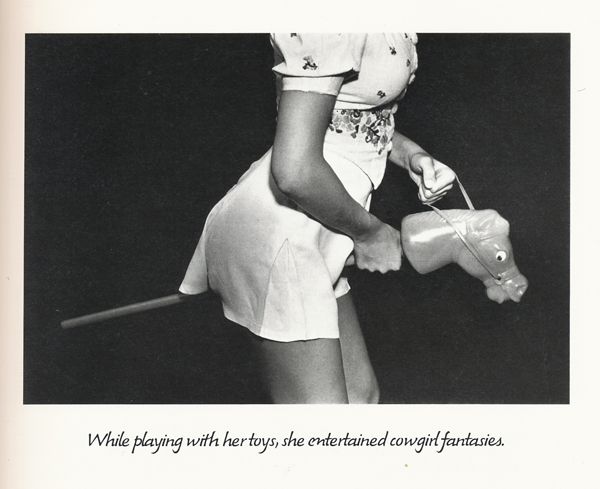
Cowgirl

Photobucket

Image by Marcia Resnick from the 1970s. Scanned from Women on Women, 1978.

Dream Home: Up-to-Date Delights, 1966

Photobucket
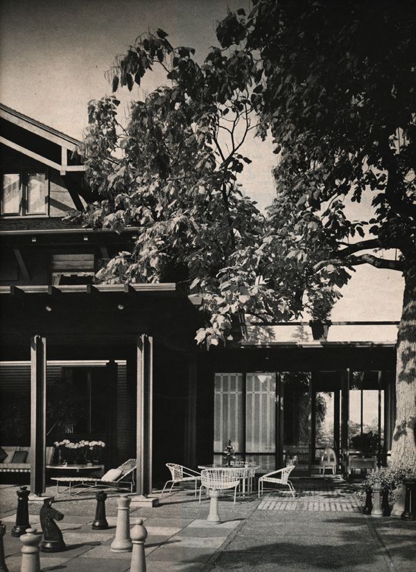
A playful new terrace laid out in a pattern of black and white squares, complete with Brobdingnagian chessmen, disturbs not one wit the serenely dignified mien of the old house. Terrace is a key link between the new living room at right and broad-roofed porch whose protruding rafters and sturdy posts are pleasantly compatible with the architectural details of the sixty-year-old house.


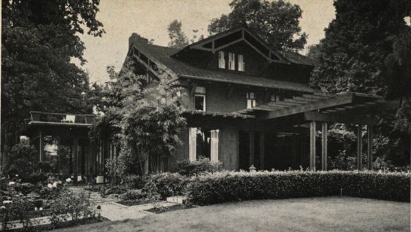
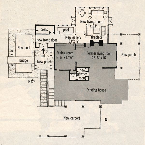
Certain houses, by virtue of their trail-blazing design, impose a stern responsibility on the sensitive, would-be remodeler. Mr. and Mrs. Raleigh Chinn of Seattle, Wash., owned such a trail-blazer - a stately two-story wood and stucco house built in 1905 from the plans of architect Ellsworth Storey, famous as a pioneer modernist. Properly respectful but far from intimidated, the Chinns and their architect, Roland Terry, plunged into a major remodeling that yielded an exhilarating new environment - and they scarcely ruffled the old house's dignity in the doing. To expand and open the dark interior to its magnificent surroundings, Mr. Terry literally ringed the house with a new gallery, living room, reflecting pools, porches, and a carport. The plan was reversed: what had been the front entrance area became a broad porch; and the new entrance, now at the rear, boats a delightful footbridge. Doubtless, Ellsworth Storey would recognize the house today despite wholesale changes surrounding it - and thoroughly approve of its yeasty new life.

Photobucket
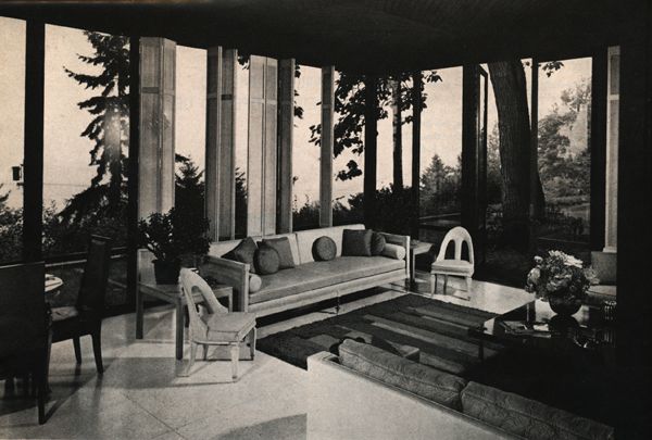
The new living room, really an ease-taking garden room, lanai in spirit, was an inspired addition to admit an un-realized world of light, sun, and a sparkling view of Lake Washington. Walls of glass, white terrazzo floors are stellar brighteners. White silk covers folding window panels.

Photobucket
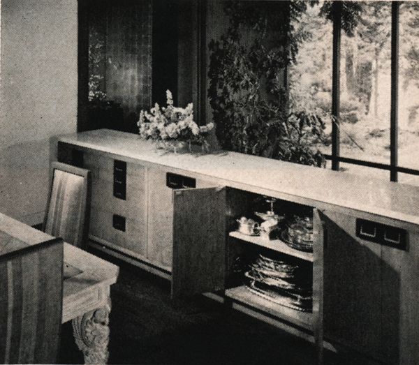
Marble-topped buffet is a room divider between dining room and new glass-walled gallery, has a prodigious storage capacity, works as a serving counter from both sides.

Photobucket
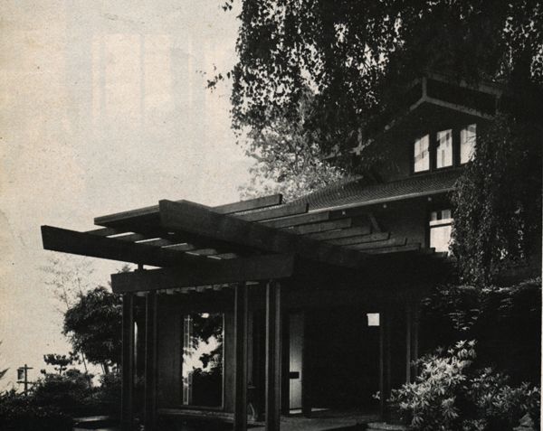
New entrance, living room wing are sympathetic outriggers designed to preserve original character of the house.

Photobucket
The old house, shaded area of the plan, has become virtually an island surrounded by a sea of remodeling amenities: a new pool and bridge, left on plan, lead to a hospitable entrance porch, thence through double front doors to a gallery with a large coat closet at one end, a decorative pool at the other. Down two steps from gallery is new glass-walled living room. New porch, right on plan, overlooks rear lawn, chessboard terrace, Carport as added, wisely, at the farthest point from the outdoors living areas. A new powder room was created in an old butler's pantry.

Photobucket
Entrance portico with open rafters and footbridge spans a pool replete eith lily pads, tall jet of water. Across bridge is the porch entirely under cover. Front doors are left.

All photographs by scanned from House and Garden, August 1966.

Eat your Carrots!

Photobucket

Photograph by Richard Avedon from Harper's Bazaar, April 1958.

Get the message?

Photobucket

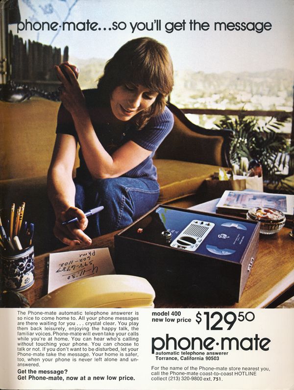
Phone-Mate ad scanned from Playgirl, December 1973.

Strawberries and Cream

Photobucket

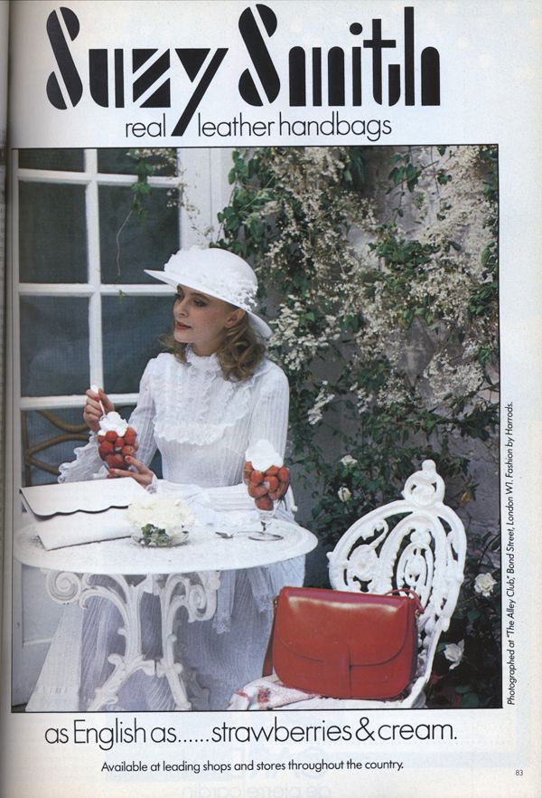
Suzy Smith ad, scanned from Vogue UK, May 1980

Refresh and Renew- Spring Cleaning

Well, spring is upon us and we all know what that means... spring cleaning. This international tradition is about refreshing and renewing our homes, not just getting out the Windex and calling it a day. Spring cleaning allows us to throw out the remnants of any unfinished projects, missed goals, and start fresh.

When I find myself in a darkly decorated (dark curtains, walls, furniture) room, I tend to feel lethargic and unmotivated. So, when it was time for me to start my cleaning spree, I traded my blacks for whites and my deep colors for those that inspire.

Barbara Barry gives us some great ideas for brighter designs with stunning linen fabrics. Try making some pillows with her Kravet fabric In Bloom or some new drapes with Linen Leaf. These linen fabrics are a wonderful base for a room that allow you to add your own accents.

Another staple of spring decor is, of course, flowers. For those of us who work around the clock, or those with bad allergies, running to the market to pick up a fresh bouquet of tulips every week just isn't going to happen. And that is why silk flowers are our best option. That's right, I said it...silk flowers. These arrangements are made to order and actually look and feel very realistic (none of that cheap waxy finish we hate). These brightly colored silk tulips are my favorite and make for a wonderful centerpiece.

So, overall, spring cleaning may not be the albatross you expected. Small and simple projects and additions to your home make a huge difference, now decorate with a spring in your step!


Eye Candy: Refresh Naturally

Photobucket

Salem cigarettes ad scanned from Oui, July 1974.

Red Sequinned Marie

Photobucket

Marie Helvin Bruce Oldfield, 1979. Scanned from Fashion Source Book, 1991.

Most perfect Jessica Rabbit dress...

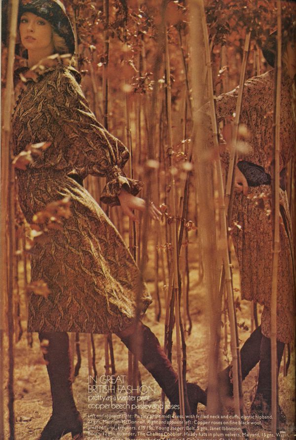
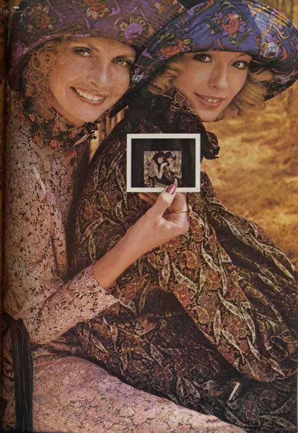
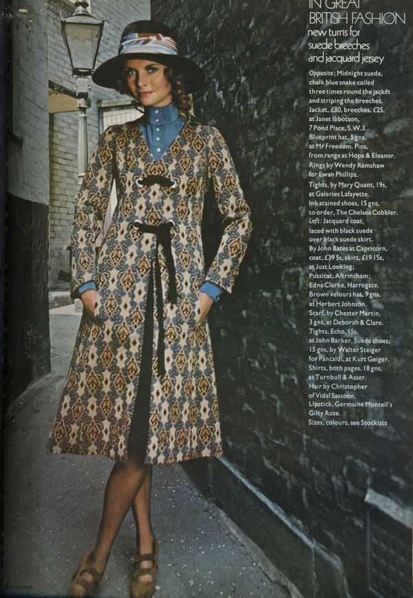
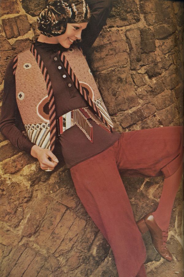
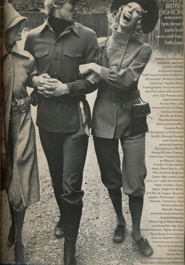
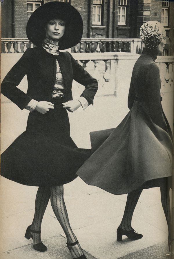
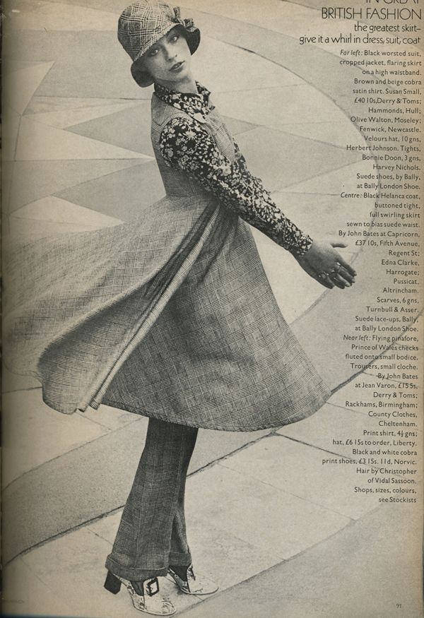
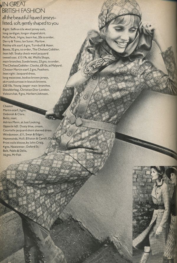
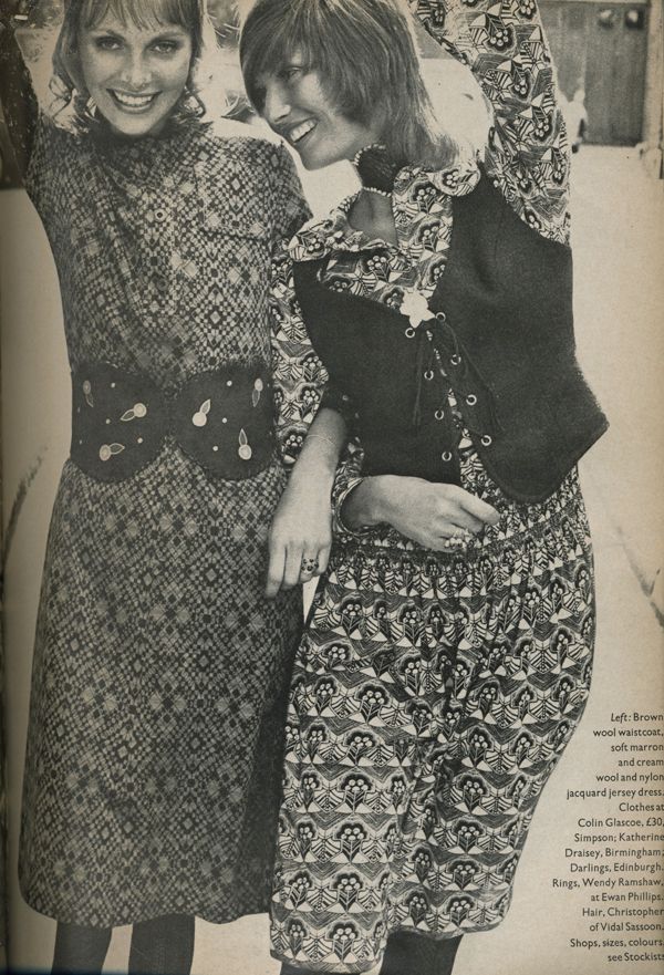
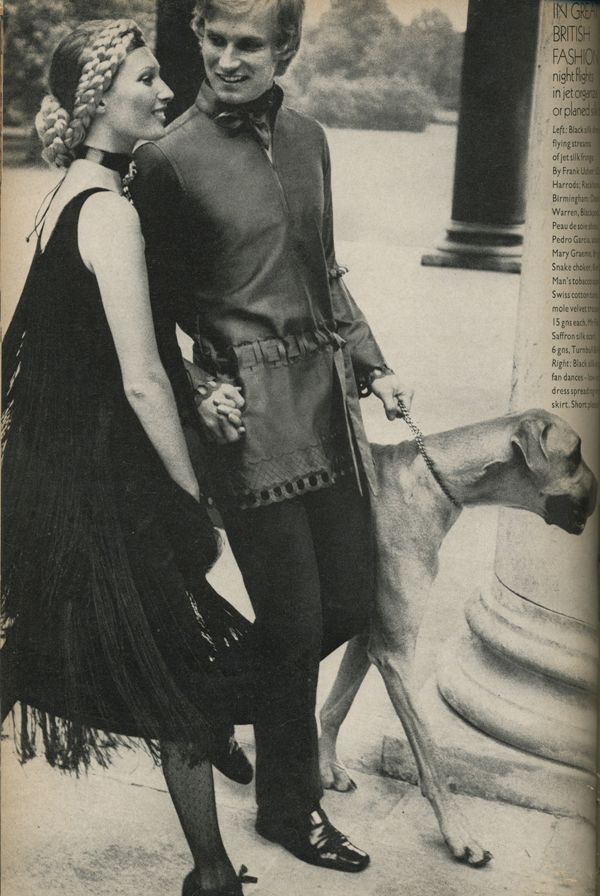
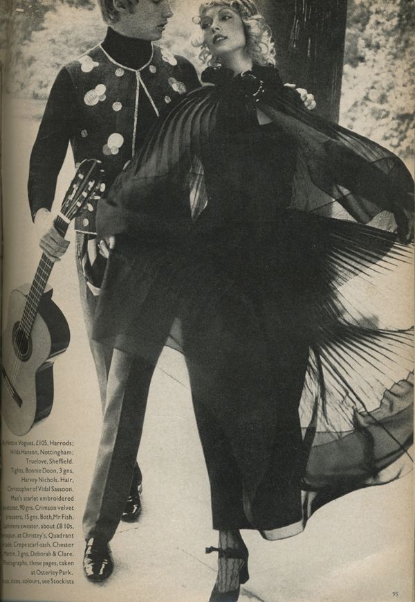
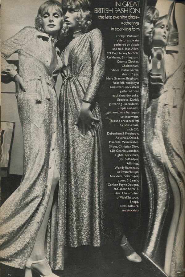
In Great British Fashion

Photobucket

Photobucket

Photobucket

Photobucket

Photobucket

Photobucket

Photobucket

Photobucket

Photobucket

Photobucket

Photobucket

Photobucket

Photobucket

Editiorial by Norman Parkinson from Vogue UK, September 15, 1970.